ComicsPriceGuide.com
Intro
ComicsPriceGuide.com is the world's largest comic book price guide with well over 1,000,000 comics in their database. With a community of over 1.1 million dedicated comic collectors, they are the go-to source for comic pricing.
Summary
Initially being hired for web design work and focusing on new page design and redesigns of old pages I was quickly promoted to web developer. Where I led multiple projects from sketch to final production, I won’t be diving into the design work here, that will be in the design section of my portfolio. Here I will talk about the technology used and go deeper into the features and pages that I created.
Skills Used
Visual Studio, Adobe XD, C#, Asp.net, Javascript, jQuery, Bootstrap, HTML, Sass, CSS, Git, MVC.
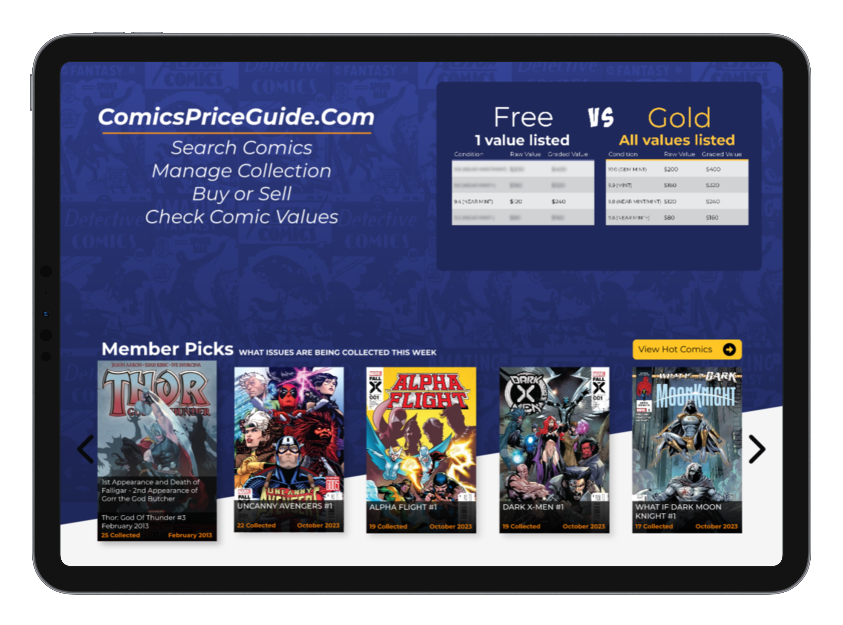
HOME PAGE
Background
This page had not been updated for quite a few years. Starting off this new version was to be used as the main landing page for the site and be used to direct users deeper into the site however that did change toward the end of the development as the company decided to adapt my dashboard as the new landing page for all users except new ones. That, however, does not stop this page from being rich with features meant to draw in not only new users but existing ones as well.
The Problem
The task was to update the existing home page to a newer version of bootstrap and implement a sales page style of design. This means it needed to display different content for each level of membership. As well as act like rabbit hole to draw users into creating a new account. Once those users had created accounts, they needed to be sold on upgrading to paid accounts to access the majority of features that the site has to offer.
The Solution
Since adapting the sales page design I made sure that every piece of content that was displayed directly took the non-logged user to a call to action to create a free or paid account depending on the content clicked. For free users I displayed 2 more sliders that were created using slick slider. Those 2 additional sliders were directly linked to content only available as a paid member driving a sense of FOMO to increase conversion rates. Paid members were able to see all content and got additional sliders to access more comic information.
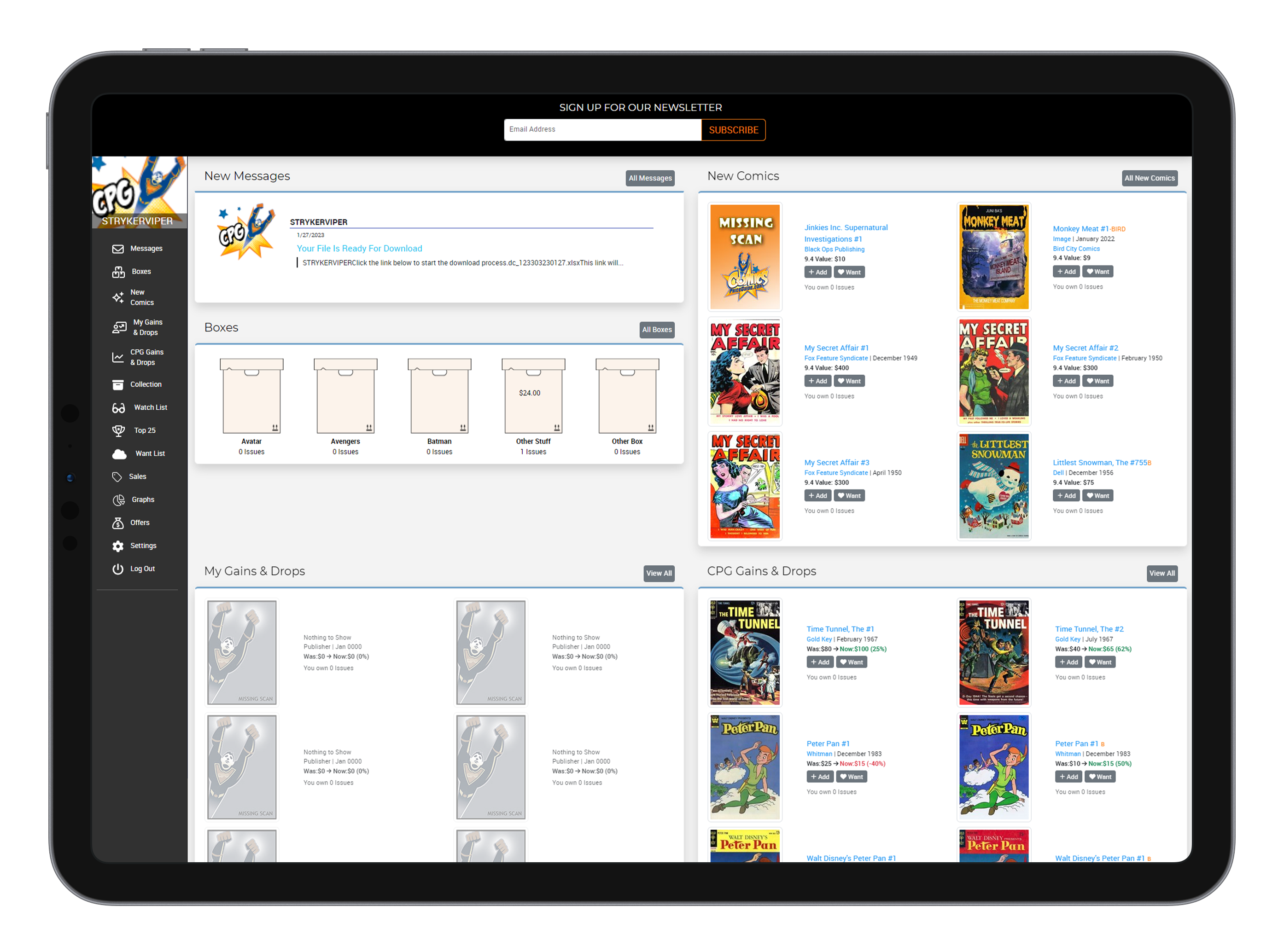
DASHBOARD
Background
The User Dashboard was the first major project I took on as a web developer during my time at comicspriceguide.com. For this project I learned how to code in C# inside of the asp.net framework. I also managed to reuse a lot of other code from the site and implement it to cut down on development time creating classes and calling data from the servers. Each section is also a html partial to allow for a possible future function to have custom dashboards depending on the user's collection style.
The Problem
Users had been asking for years for an easier way to view their collections and other various data. They need a way to view their collection in a quick summary style. Alongside that they would need to see new comics outside of their collection so that they can collect more. I needed to also implement a FOMO strategy for different memberships that don’t have access to all the data that will be displayed on the dashboard. The problem is finding a way to summarize most of the site pages and function into a single page.
The Solution
A dashboard was the obvious solution to address these problems. I kept the content of each section limited to six items and chose sections based off of most in demand pages and functions like top 25 and recent value changes. The side bar menu also gives users the ability to access data that didn’t fit well into our dashboard such as graphs. Which got their own page due to the number of graphs available. I implemented the paywalls by blurring out certain sections and having a call to action to upgrade a user's membership to view content.
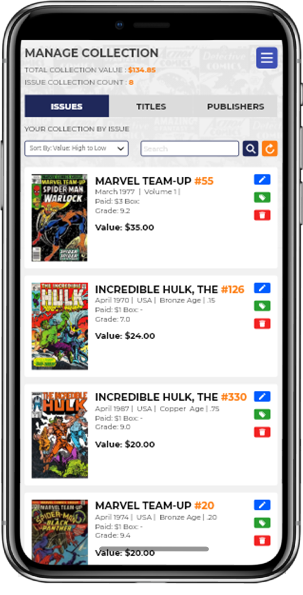
COLLECTION
Background
This was my take on a whole new collection management system. The current version was very limiting in my opinion, only allowing you to search by publisher and having no sorting functionality. This project was one I took the initiative of and worked on in between other projects and tasks. This project never hit final production, but I did want to talk about it here due to the complexity of it.
The Problem
The first problem was dealing with no sorting functionality being available to users who are browsing their collection. Secondly, the user would have to click a minimum of 4 times to access a single issue in their collection and that was far too many for a user to experience. Once a user did find the issue that they were looking for they were given very limited data which meant they had to click once more on the issue to see more details. Finally, the layout was a list with very small icons showing the covers of the comics. I wanted to emphasis the comic covers in a new layout since comics tend to be desired because of their covers.
The Solution
Fixing the sorting functionality was rather simple just adding a dropdown list with functions like value high to low, value low to high, highest grade, and lowest grade. Fixing the UX of the page was a bit harder. To fix this I switched the main page away from only showing publishers to having a tab page design of issues, titles, and publishers. To fix the limited data and layout issue I developed a new grid system for listing out the comics. This allowed us to maximize very limited screen real-estate to show larger covers and more data per grid item.
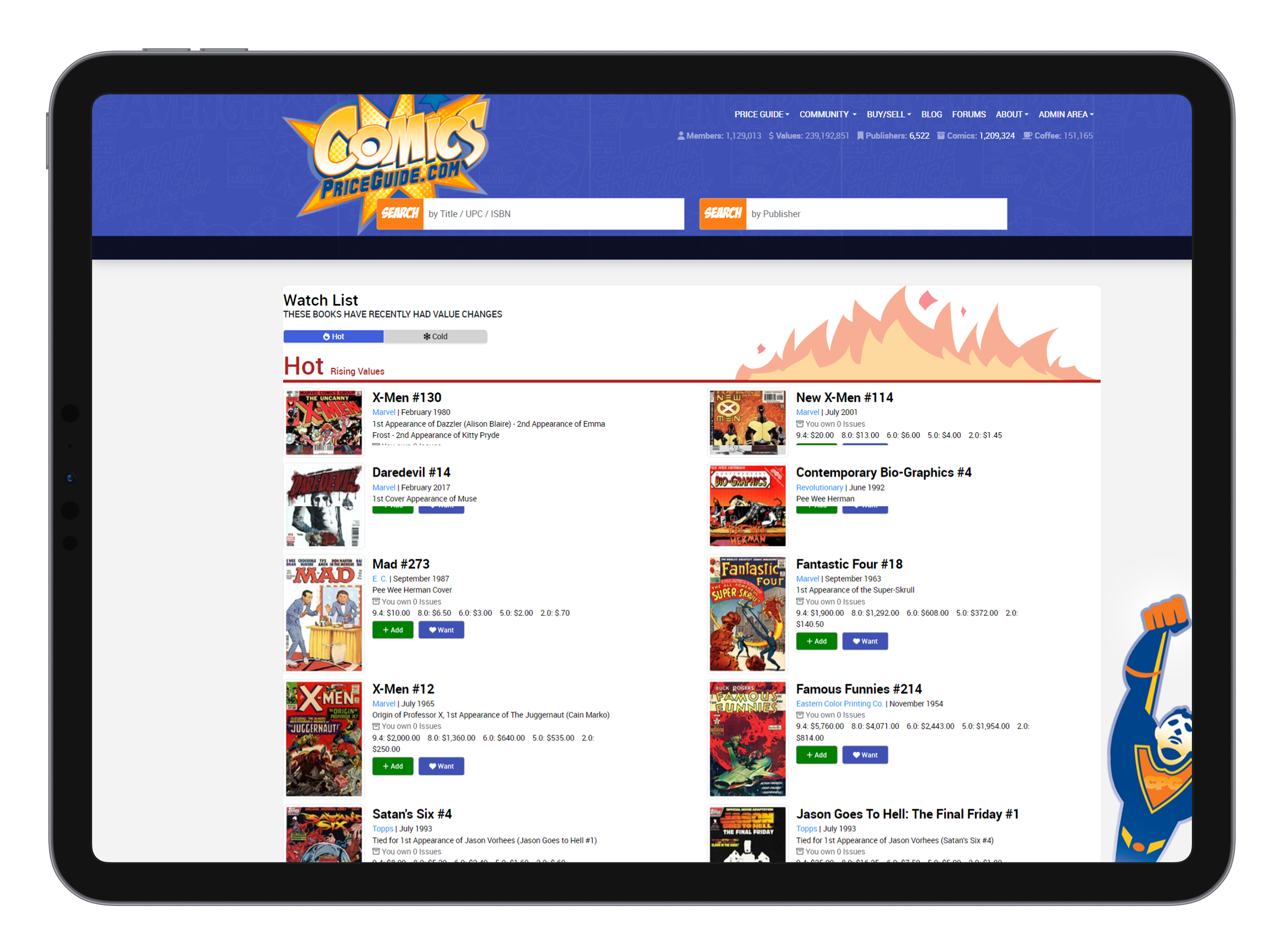
WATCHLIST
Background
The watch list was a whole new page that would show users not only new comics rising in value but also older comics that have gained traction as well. Previously users only had a small section on the home page that showed a few comics with changing values. This page gave them a more in-depth look into value changes.
The Problem
The problem with this new page was to figure out a good layout to show both rising value comics and dropping values. The options were to either show them as a mix or separate them within the page. What would be the best layout to deliver all this data and show the comic covers clearly?
The Solution
I went with a grid layout similar to my collection management page, however that was in 3 columns with card items. Where this is 2 columns with no card items breaking up the items. This allows for a bit more use of screen size to fit more data per item. To be able to display both rising and falling values I first went with a one page two section layout but eventually settled on a tab style page.